Project
be aWear
Scope
UX Research · UI Design · Branding
Timeline
Oct – Dic 2023
A mobile experience designed to make fashion sustainability easier to understand
be aWear is a concept app developed during the UI Design Master at Talent Garden.
The project was created to help users make more conscious decisions about clothing by turning sustainability into a clearer, more actionable digital experience.
Overview
In fashion, sustainability is often difficult to interpret.
People are increasingly aware of the issue, but rarely have access to tools that make the impact of their purchases and existing wardrobe truly understandable.
be aWear was designed to close that gap by combining product awareness, wardrobe management, and everyday decision-making in a single mobile experience.
Challenge
The challenge was to translate a complex topic into an intuitive product.
The app needed to help users evaluate garments, understand their environmental and social impact, and encourage more responsible habits without making the experience feel heavy or overly technical.
Solution
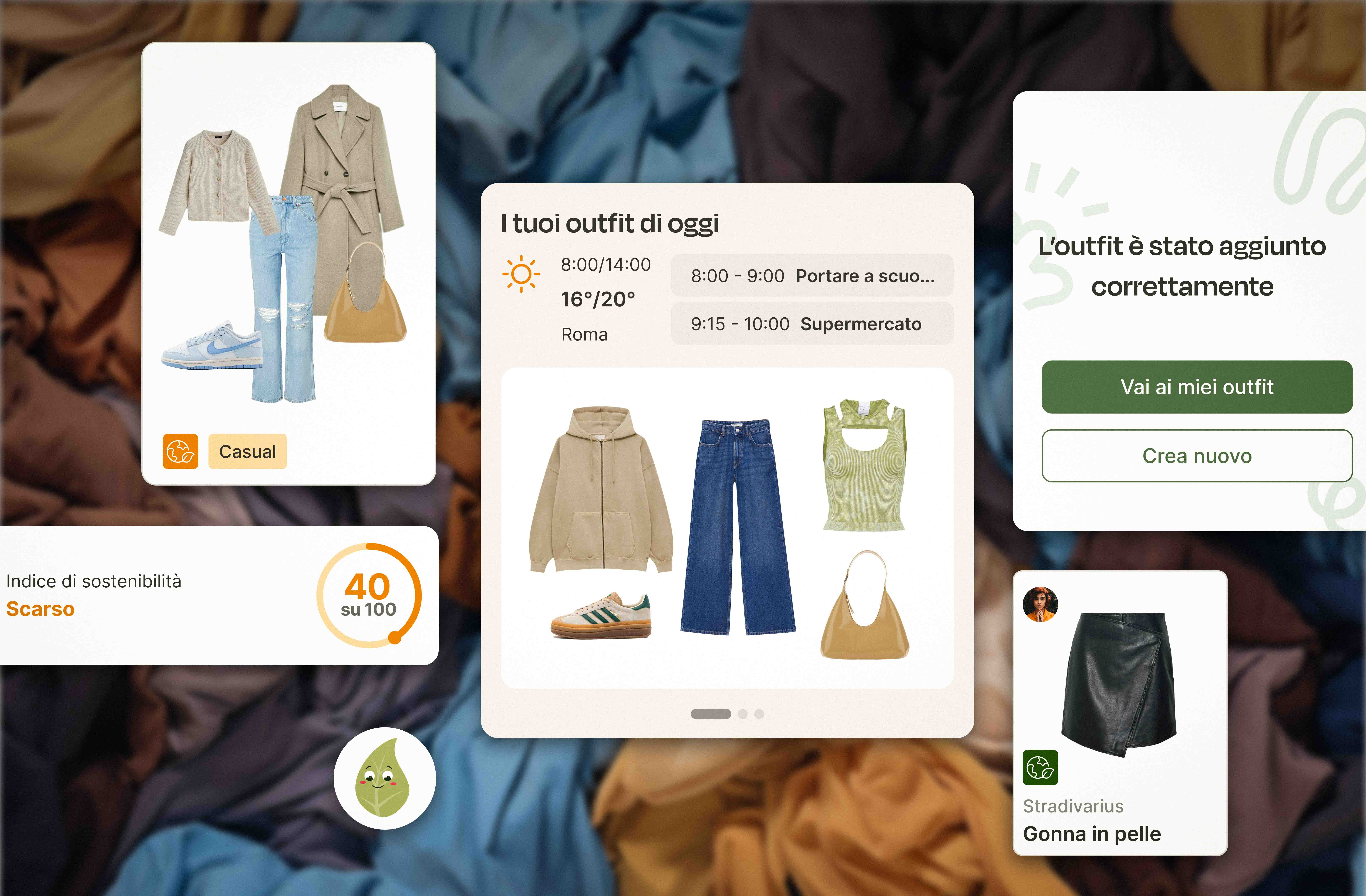
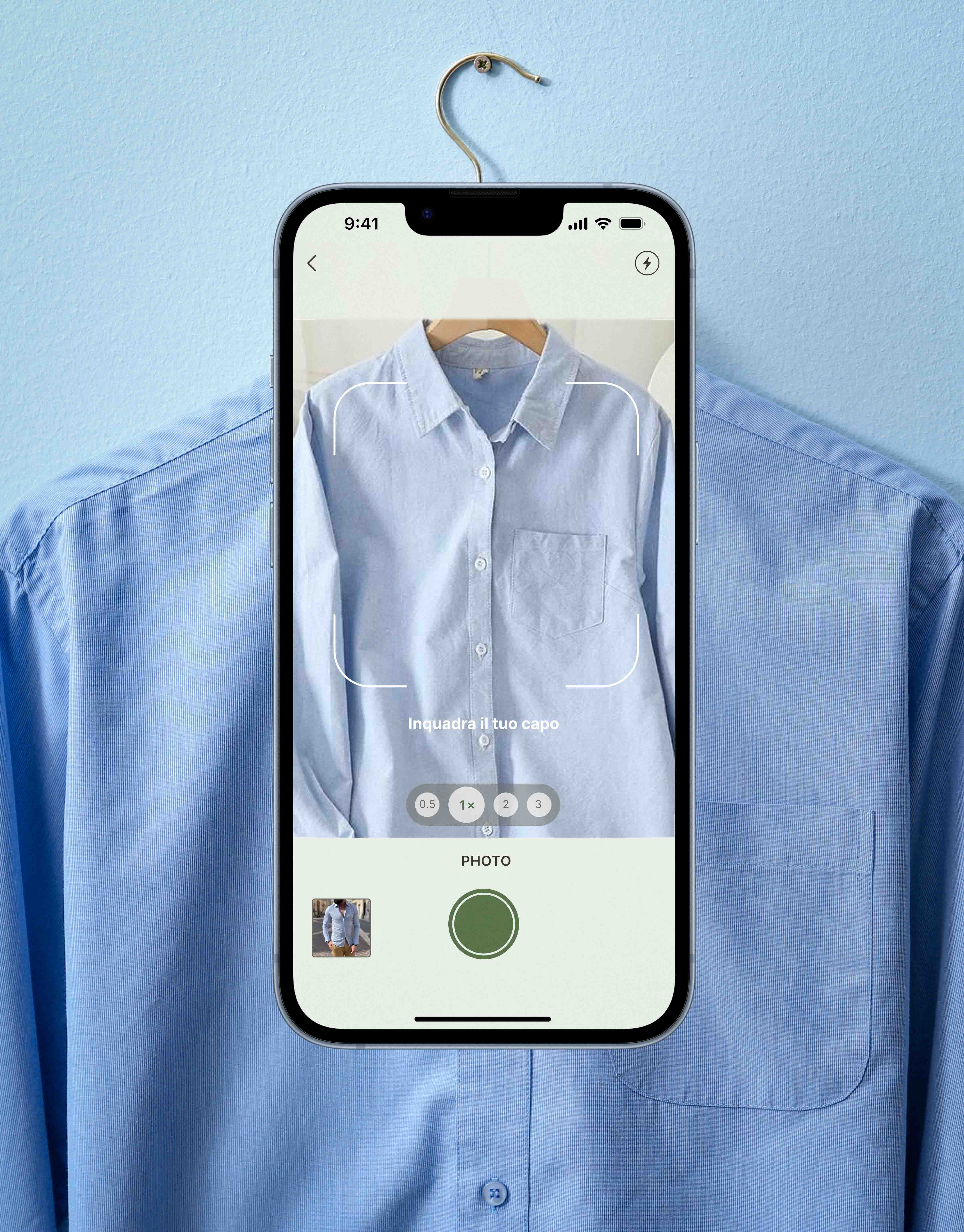
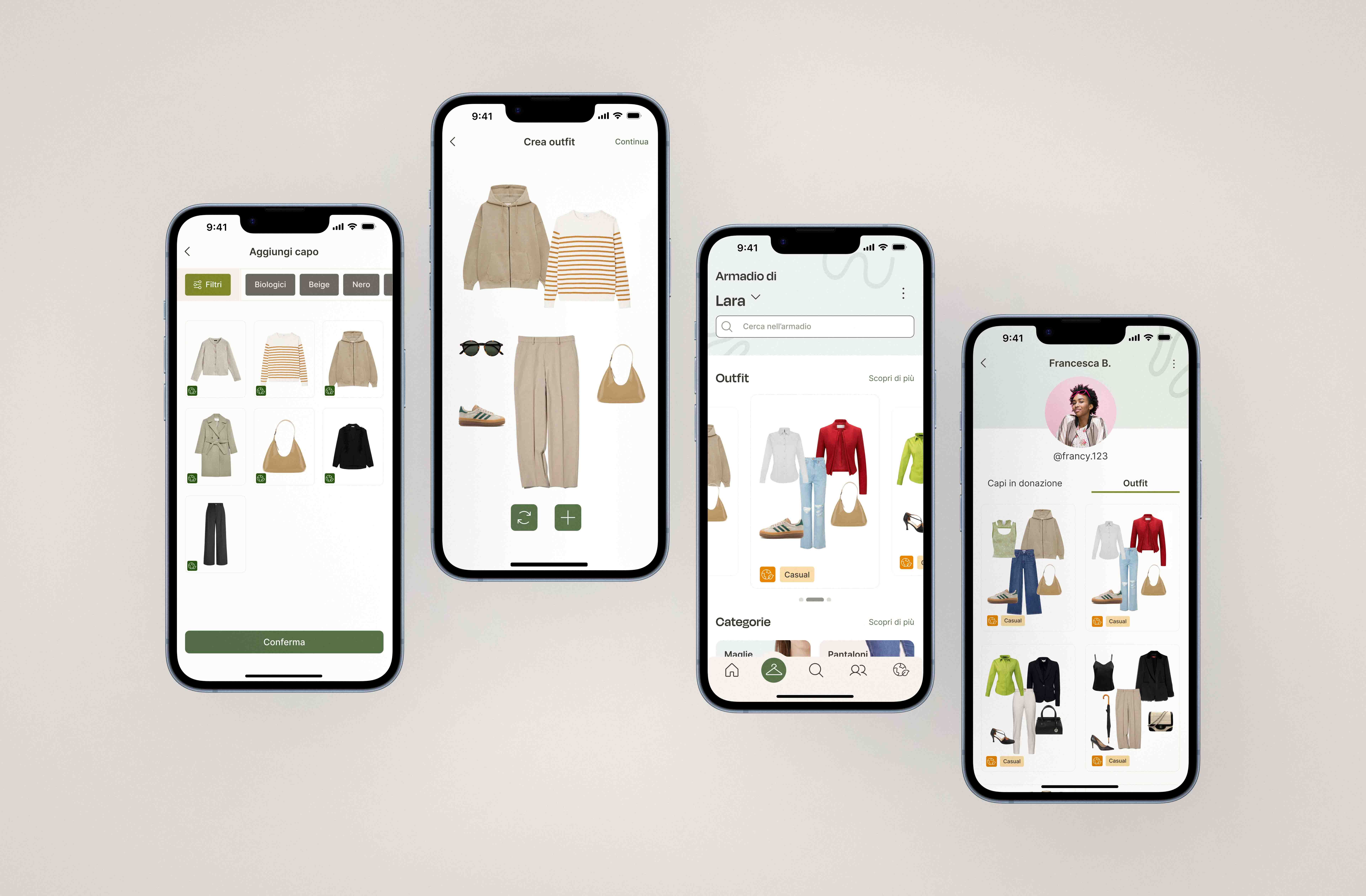
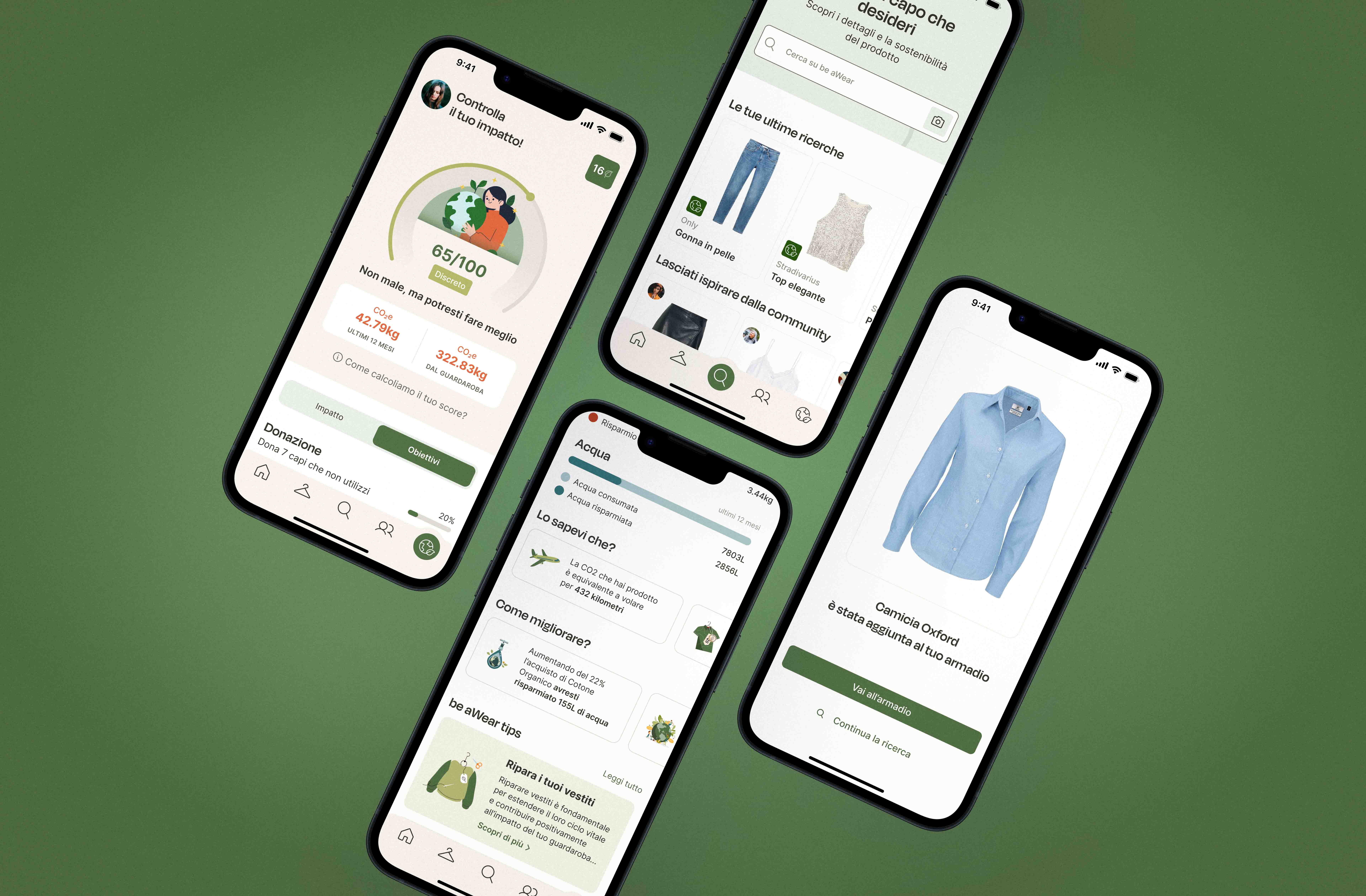
be aWear combines garment recognition, a digital wardrobe, and engagement features to support more conscious choices over time.
Users can:
search for garments via text or photo
access sustainability-related product information
build and manage a digital wardrobe
create outfits from existing pieces
monitor their impact through scores and progress-based mechanics
receive contextual suggestions through an assistant
engage with community features designed to promote reuse and reduce impulsive purchases

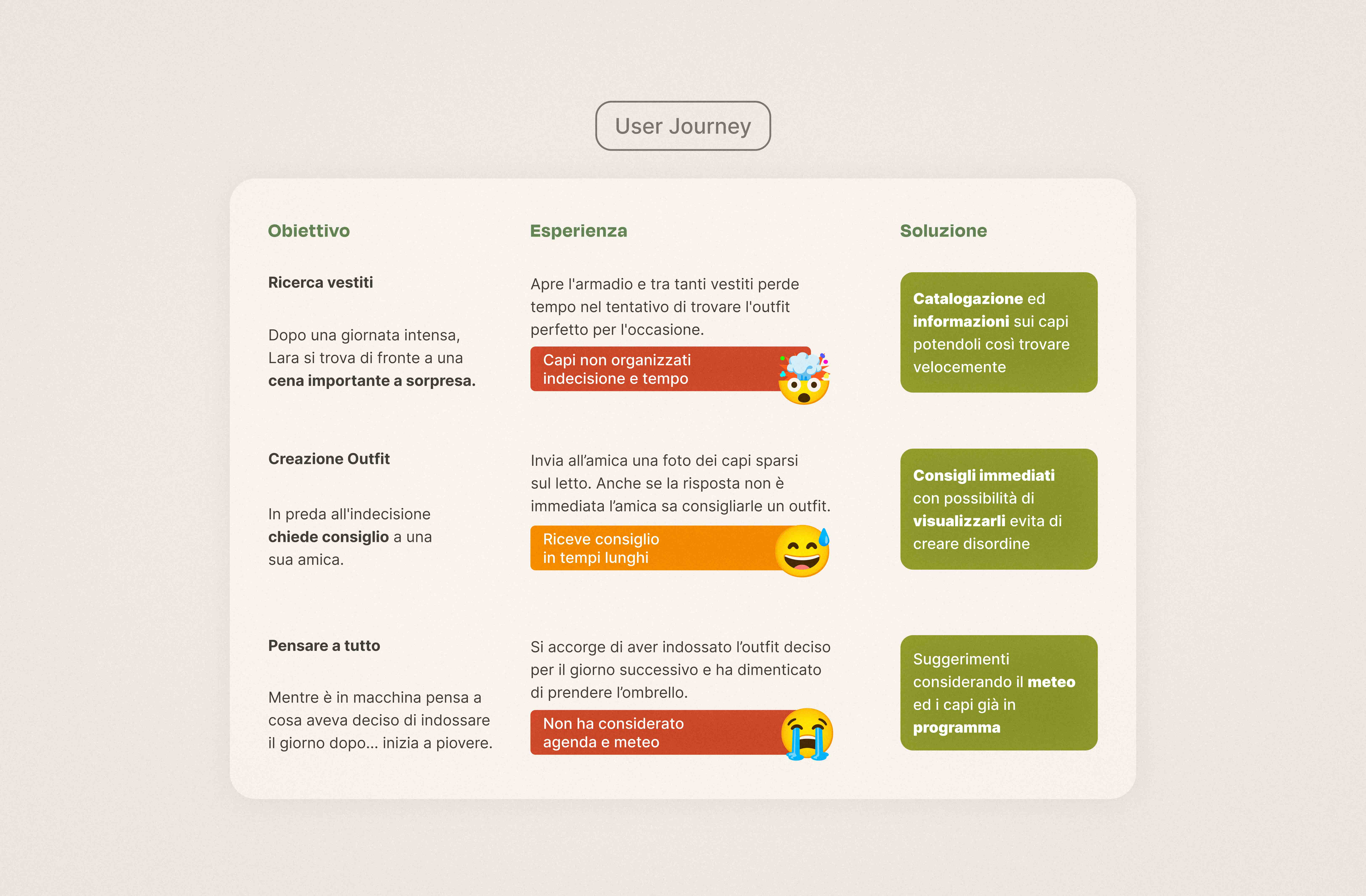
Discovery
The project began with a discovery phase focused on understanding the landscape and identifying opportunities.
We worked on benchmark analysis, proto-personas, and user journeys to define positioning, clarify user needs, and shape the product’s core logic.
Structure
From there, we translated insights into functionality, information hierarchy, wireframes, and user flows.
This phase helped define the overall architecture of the app before moving into the visual system and interface design.


Visual System
The interface was designed to reflect the values of sustainability, clarity, and accessibility.
A palette of neutral tones and layered greens creates a distinctive but calm visual language, while Degular and Inter provide character and readability.
Simple outline icons and lightweight illustrations reinforce the app’s approachable tone.
Prototyping & Testing
After defining the design system, we developed the full UI and moved into prototyping.
Low-fidelity prototypes and usability tests helped us validate flows, refine interactions, and evolve the product into a high-fidelity prototype.